Every Flashing Element On Your Site Alienates And Enrages Users
Everyone hates flashing banner ads, but maybe they’re a necessary evil. Creators want money, advertisers demand a certain level of visibility for their ad buys, maybe sites are willing to eat the cost in user goodwill. Fine. But what’s everyone else’s excuse?
A few days ago I needed to look up an obscure point of Jewish law, as you do, and found this Jewish law website:
 I can’t figure out how to include screenshots of flashing elements here, so I’m just connecting them with arrows.
The background toggles every few seconds between a picture of a rabbi and a picture of . . . a different rabbi? There’s no conceivable benefit to this and it makes it almost impossible to concentrate on the text.
I used to think I must be the only person who worried about this; maybe it was a weird OCD thing. But I asked about it on the ACX survey . . .

. . . and 88% of people find them at least a little annoying! 16% of people go all the way, and say they wouldn’t use a website that has them!
Yet websites have been adding them to more and more parts of the user experience. Most aren’t as blatant as the Jewish law site, but they’re still there. Here’s what it looks like to try to write a draft here on Substack:
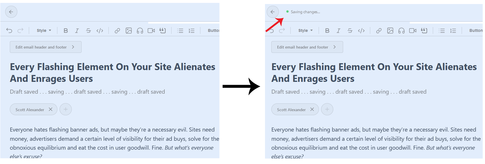
As long as you keep typing, the “Saving Draft” button flashes in the upper left corner every few seconds. There’s no easy way to block the element with AdBlock without also removing important functional elements of the editor. And speaking of AdBlock, its interface looks like this:

An unblockable moving status bar that switches every few seconds between different messages about the product! This is what they think the people most obsessed with blocking flashing/changing elements on websites want! This new “show a constantly-moving status bar on screen to tell you when they will change another flashing element” thing has also made it onto the front page of Bing, although luckily you can dismiss it there.
I would have expected Google to resist. They haven’t. I can no longer write things on Gmail - I have to compose on Notepad and then copy-paste to the Gmail window - because they’ve made it look like this:

It cycles between these every few seconds, irregularly, as long as I keep typing. It baffles me that these companies will spend millions of dollars optimizing every aspect of their user interface, then add one completely unnecessary feature that ensures I will never spend more than the absolute minimum possible amount of time using their product.
I know I’m not the only person who hates this, because when I Google it, I find Gmail help forum threads like:
…containing messages like these:
![]() Selected/excerpted messages stuck together for easier reading.
Selected/excerpted messages stuck together for easier reading.
The response from the company is always the same: “We don’t support disabling that feature”. Big tech companies would rather lose the 16% of users who say they would stop using a site with flashing elements, plus irritate the further 72% who merely find it annoying, than make the slightest concession to not having “Draft saved!” flash on and off on their site every few seconds.
I hope this message reaches some of the people who work in interface design for tech companies. If your site does this, I hate you and will try to avoid using your product. If I can’t avoid it, I will turn on AdBlock for your site in particular to block the element (incidentally denying you revenue). If I can’t get AdBlock to block the offending element in particular, I’ll just hate you even harder, to make up for it.